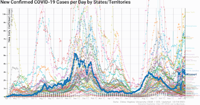
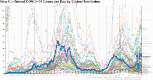
An interactive visualization of the exponential spread of COVID-19 in the MidWestern States, with additional Missouri and St.Louis highlights
 |
| Missouri Highlighted Covid-19 Cases per day |

https://tidbitsbyscotty.blogspot.com/2021/12/covid19-case-graphs-with-reports-mo.html

Detailed Data Report: New Confirmed COVID-19 Cases per Day Midwest States only
Largest percent increases since one week ago:Largest percent decrease since one week ago:- South Dakota: -27.62% change
- North Dakota: -26.74% change
- Minnesota: -17.68% change
- Michigan: -16.55% change
- Nebraska: -15.27% change
- South Dakota: -27.62% change
- North Dakota: -26.74% change
- Minnesota: -17.68% change
- Michigan: -16.55% change
- Nebraska: -15.27% change
 |
| Comparing the Total Vaccine vs Deaths for Missouri link |
 |
| Missouri Vaccination Stats vs Deaths for Dec 2020 to Dec 2021 Link |
Detailed Data Report: Total COVID-19 vaccines allocated by States/Territories
This report is generated based entirely on the visualization options you have selected and includes only the data displayed above. As you change the chart options, you can regenerate the report with your new data selection. (Click on any country in this report to add it as an additional highlight.)
Largest percent increases since one week ago:- Missouri: +0% change
Largest raw increases since one week ago:- Missouri: +0 vaccines allocated
Largest percent decrease since one week ago:- Missouri: +0% change
Largest raw decrease since one week ago:- Missouri: +0 vaccines allocated
Try the Interactive Map to Track the Covid-19 Fiasco for your state or Territory. 91-DIVOC
- Missouri: +0% change
- Missouri: +0 vaccines allocated
- Missouri: +0% change
- Missouri: +0 vaccines allocated
Try the Interactive Map to Track the Covid-19 Fiasco for your state or Territory. 91-DIVOC
Detailed Data Report: New People fully vaccinated from COVID-19 per Day link
This report is generated based entirely on the visualization options you have selected and includes only the data displayed above. As you change the chart options, you can regenerate the report with your new data selection.
Guide to the 91-DIVOC Visualizations
Data Sources
All of the data presented on this visualization comes from a trusted, high-quality data source: either Johns Hopkins University, Oxford University (Our World in Data), or The Atlantic (COVID Tracking Project). You can switch between the data sources by using the "Data Source" control at the top of the visualization. By default, Johns Hopkins University is displayed by default but your data selection can be stored by bookmarking a "Direct Link" that is displayed below each of the visualizations. All data sets are updated multiple times each day.
In the visualization controls, the "Data" selection allows you view various different data about COVID-19, including cases, deaths, tests, hospitalizations, test positivity rates, case fatality rates, and more. If a data selection is not available for a selected source, you will be prompted to switch to a data source where the data is available.
The specific data source used will always be displayed in the lower-right corner of the graph.
Regions
In addition to the country and state data provided by the data sources, several regions are added for additional context. These regions include:
- All World Health Organization (WHO) regions, which includes:
- African Region (WHO-AFRO)
- Region of the Americas (WHO-PAHO)
- South-East Asia Region (WHO-SEARO)
- European Region (WHO-EURO)
- Eastern Mediterranean Region (WHO-EMRO)
- Western Pacific Region (WHO-WPRO)
- The European Union, based off the current union of 27 members states ("EU-27"). Note that the EU-27 does not include the United Kingdom.
- The four United States' US Census Bureau-designated regions:
- Northeast, which includes New Jersey and Pennsylvania and states further to the northeast
- South, which includes Delaware, Maryland, West Virginia, Kentucky, Arkansas, Oklahoma, Texas, and all states south
- Midwest, which includes the Dakotas, Nebraska and Kansas
- West, which includes Hawaii and Alaska
Normalized Data by Population
The first two visualizations displays the raw case data (ex: number of cases, deaths, tests, etc). The last two visualizations displays the same data normalized by the official population displayed in cases per 100,000 people. This normalized view provides a more equatable comparison between regions of different sizes (ex: California, Texas, Illinois, and New York will have more cases if the distribution of cases were uniform simply because they have more residents). The formula used is:
- For populations of countries, "List of countries and dependencies by population"
- For populations of US states and territories, "List of states and territories of the United States by population"
Direct Link
Finally, every change you make to the visualization will generate a "Direct Link" that will link to the specific visualization you have created. You can bookmark this link to view it later or share it with friends/family to share the exact graph you are exploring.
More Information
There are many more options to explore in the visualization controls, including the ability to save an image or video/GIF of your graph. This 91-DIVOC project is a side-project of mine while I'm not working on teaching the next generation of students about Computer Science at The University of Illinois. You can read about my motivation for creating this project, and some of the uses it has received, on the "Overview and Motivations " page.
Finally, if you have any questions or feedback, you can write to me (faculty website, and additional contact information at the bottom of this page) -- I read all of the e-mails, reply to as many as I'm able to, and I'd love to hear from you! :)


.jpg)


No comments:
Post a Comment